The main objective of your portfolio is to present your work in the clearest and overall best possible way. For that reason, it is important that your website itself has a clear structure. If a visitor of your website won't get lost in it, you are halfway there.
Possibilities for structuring your portfolio web on JuicyFolio are following:
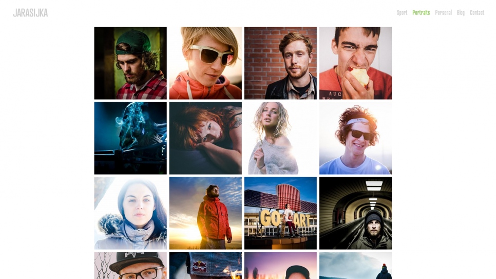
The Simplest (Recommended) Variant
Clicking on a specific link in the menu will directly open
a content of the required gallery (or a text page, a form etc). It is the second most used variant with which you can
easily pick the best of your work and refer to it directly.
Without an unnecessary clicking through folders
or multiple portfolios. This variant is also useful if you would instead have pointless folders with only one gallery in each of them. Example: jarasijka.com
More Complex Variant (the Middle Way)
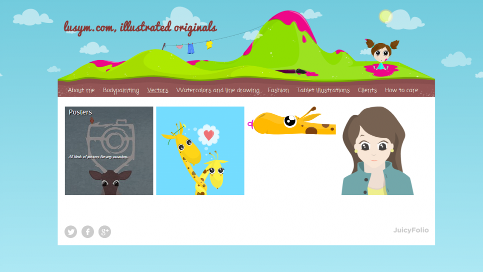
The menu contains folders that store galleries. Only after clicking on a gallery inside a folder, the content will appear. This variant is a pleasant compromise between the emphasis on the content and on the efficiency of your website. Example: lusym.com
The Most Complex Variant
(for More Complicated Presentation)
The menu contains several portfolio libraries that contain folders with galleries. You can use this variant if you need
to divide your website into multiple themes (for example
for personal and work related photographs). However in that case, we recommend you to set up two individual simpler websites rather than one bigger, more complicated, and less transparent.
In conclusion, don't forget that simple is better. And that is true mostly for the easy movement of your customers through your website. The clearer your website will be for them, the larger is the probability that they will find exactly what they were looking for, and your mere visitors can then become your customers.

