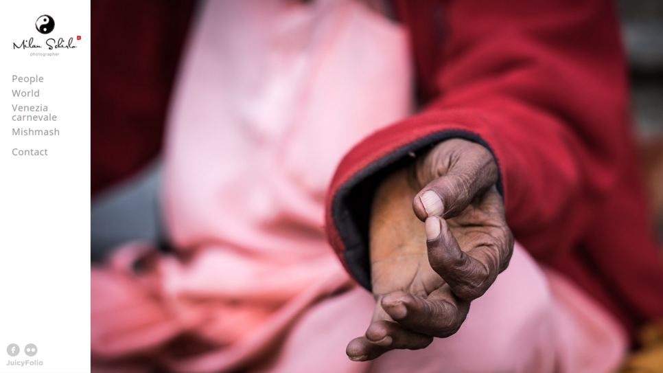
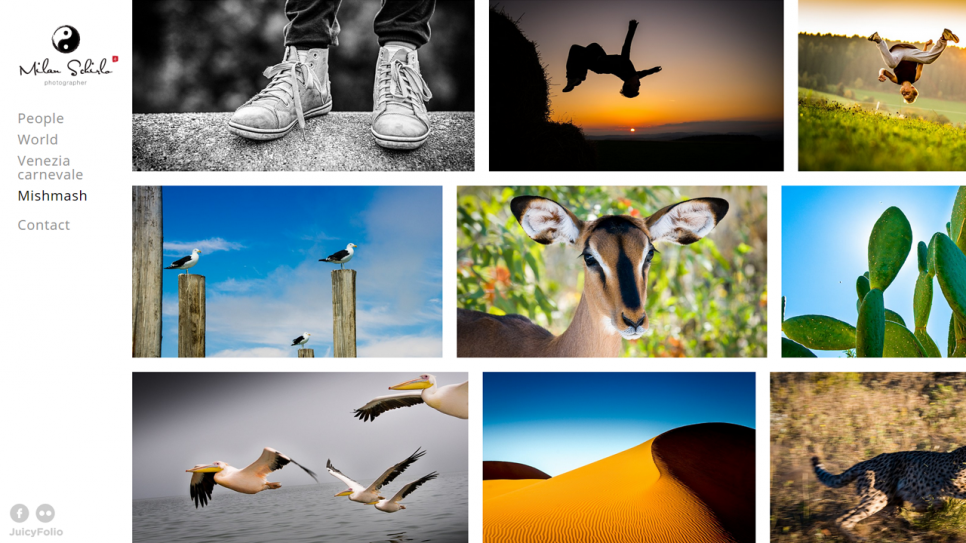
Photographer Milan Schirlo came to us with a very clear vision. He wanted to highlight his photos straight on the homepage of his new portfolio and at the same time offer a clear content overview through the web structure.
Milan chose our at that time newest design FullTopStep-02 with image overview at the right side with a left menu bar. But he had also some of his own ideas that he wanted modified his website with, just as he would like it.

First of all, Milan wanted to visually stretch out the slideshow on his homepage so that it would cover the entire right side of the screen, corner to corner. With this slideshow, we then manually setted up a so called Ken Burns effect of blending and moving images.
Further we positioned his logo to the left bar and indented "Contact" from the rest of the links in menu, so that it would distinguish from the image galleries.

Finally, we setted up not only a unique mail address for Milan, but also his own mailbox without the need to use services of any external provider.
The finished website MilanSchirlo.com will captivate any visitor's attention the moment they enter his homepage thanks to the unique welcoming presentation. After that they can visit each of Milan's for image galleries through the minimalistic menu bar and enter large previews of his photos that they can go through from one to another.


