We observe the World around us in a very interesting way. We can focus only on a small fraction of our field of view, yet we think we are able to see in widescreen.
We are using this idea for multiple designs including JuicyFolio HD designs. Those can present your work within the full scope of your browser and therefore maximally pull your visitors into your project. But using these designes comes with its own set of rules.
What Not to Forget
In order to achieve the most enjoyable experience for
your visitors, you need to remember a few rules and image requirements when selecting this design type.
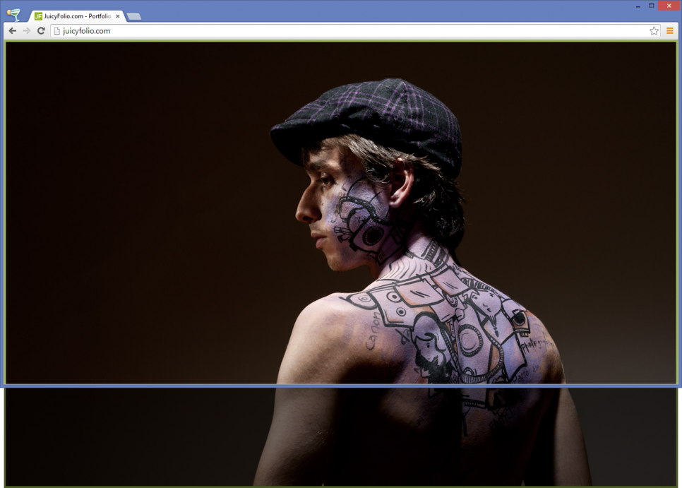
The visible part of the image used for a HD design depends on the size and aspect ratio of your visitors web browsers.
It is therefore not only a question of their monitors or other devices, but also whether they browse your website in a smaller or a fullscreen window.
We have discovered that the vast majority of devices used for Internet browsing today is widescreen with aspect ratio set or close to 16:9. Most people browse the Internet on their devices in this aspect ratio, either in fullscreen or smaller window, so we can then assume that the content adapted to this state will be shown exactly how its author intended it.
How to Do It
But what does all of this mean? The HD designs show web
content in the way that every visitor would see only the main image of said design, never its edges (for that you can use the FlowTopStep-02 design), however each visitor can view this website in a different size and aspect ratio, and therefore see a different part of the image.
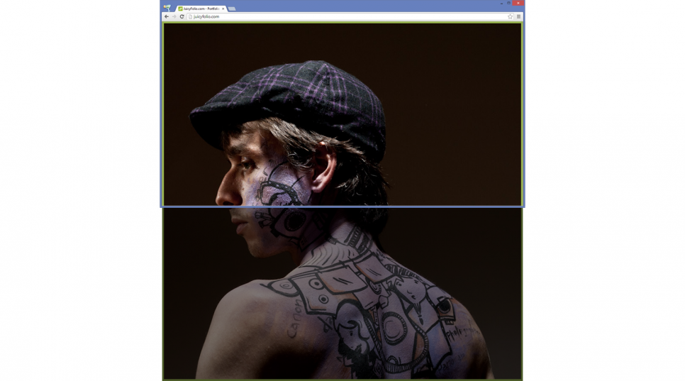
Example of a vertical image in HD design
So if the most important part of your image is placed by the right or left side, some visitors of your website with smaller monitors, reduced windows, or while browsing on their mobile phones, may not see this specific part of your image.
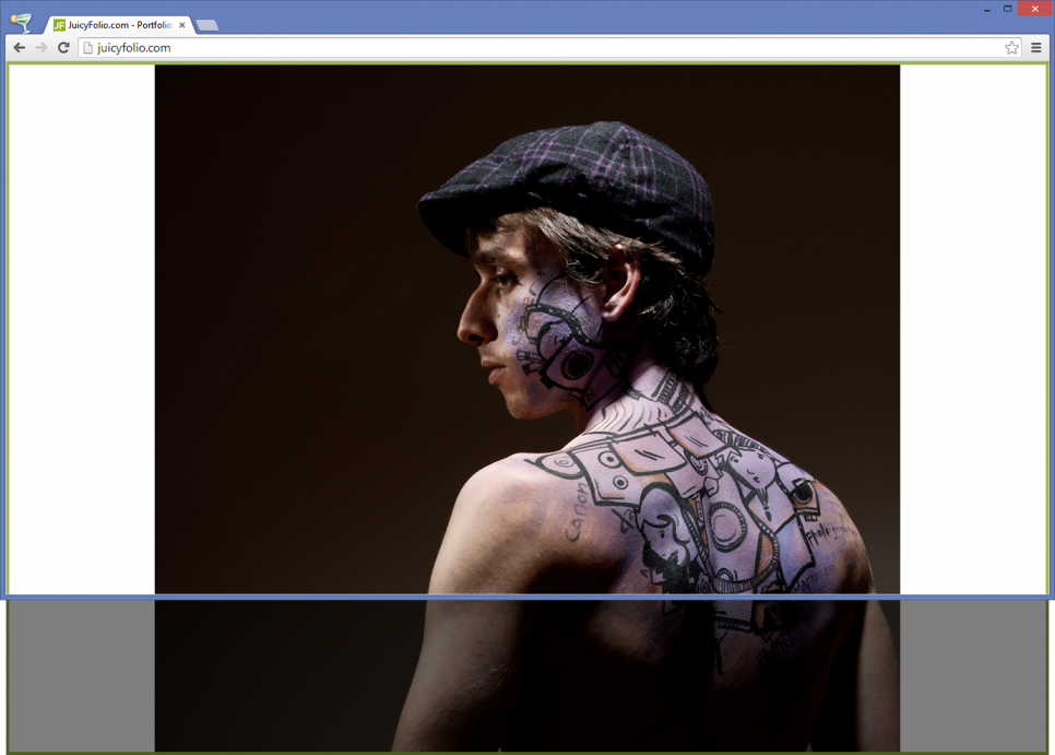
Another problem occurs if you try to force the 16:9 aspect ratio to for example a square image with blank panels
on the sides, as shown on the image below:
Example of a square image with white side edges
This is why you need to choose images for HD designs with their main motive set slightly to the centre (but you can still abide the golden ratio as with square images). Then you can be sure that every visitor of your website will see exactly what you intended to show them.
So Don't Forget That:
- to HD designs, you need to upload images with aspect ratio 16:9, if possible with the size of 1920x1080.
- the image will be embedded vertically by the upper side and horizontally by the middle.
- the specific part of the image you will see depends on the size and set aspect ratio of your browser window.

