JuicyFolio text editor offers a lot of functions for editing your text in galleries, on your blog, or on common text pages. When using these functions, your text should be as readable and synoptic for your visitors as possible. But how to achieve this?
Paragraph Styles
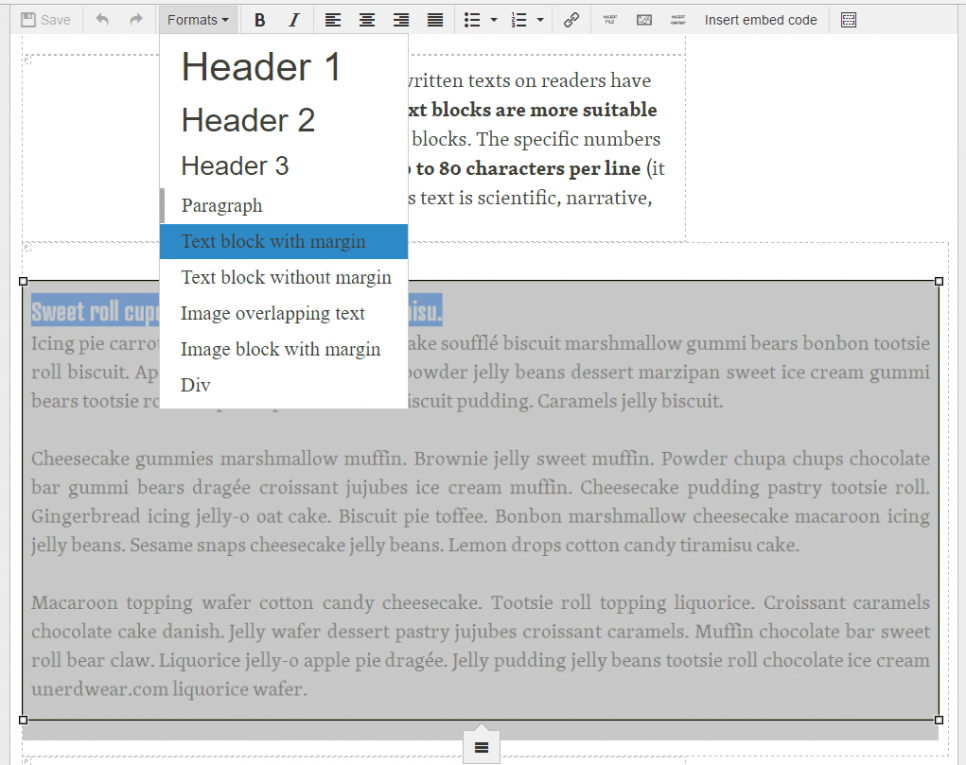
One of the main JuicyFolio text editor functions is setting the width of your text paragraphs. Besides the paragraph style for images overlapping text that applies to large images in your articles, JuicyFolio offers two paragraph styles: Text block with margin and Text block without margin.
Text blocks with margin are used for example even on this blog. It narrows the text to paragraphs with lesser amount of characters on each line. Text blocks without margin then offer higher number of characters. Though this may look good on some website (mainly if those websites use larger fonts), we generally recommend you to use text blocks with margin. Why?
Studies on the influence of written texts on readers have shown that more narrow text blocks are more suitable for reading than wider text blocks. The specific numbers vary somewhere between 50 to 80 characters per line (it also depends on whether this text is scientific, narrative, expository, or other).
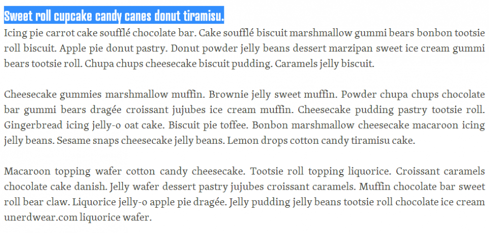
And it is this number of characters for each line that is used on JuicyFolilo, though the specific number of characters per line depends also on the size of your font. So if you want your texts to be as easiest and comfortable as possible for your visitors to read, we recommend you to use this type of text block style.
Narrow paragraphs however do not necessarily correspond with the style and size of the font you have selected. But if you contact our customer support, we can set the text block style just for your needs and for your visitors' most comfortable reading.
Text Alignment
While talking about text alignment, we recommend you the basic left align for your text. Besides aligning to other sides (right and centre), our toolbar also offers a justify alignment, where your text will spread to the right border of its paragraph. However text with justify alignment applied to wider lines can be a bit difficult to read (reader can sometimes get lost in a monolithic text) and create unpleasant "rivers of white", when applied to more narrow lines. So if you want to apply justify align to your text, you need to find the right compromise between the text blocks width and font size, and also keep in mind the potencially more difficult readability.
Color Balance
You can also change the color of your text and its background in the content settings of your website. However you still need to be careful with these color contrasts, because it is also essential for your website to have a uniform look and to follow the same principles and text styles.
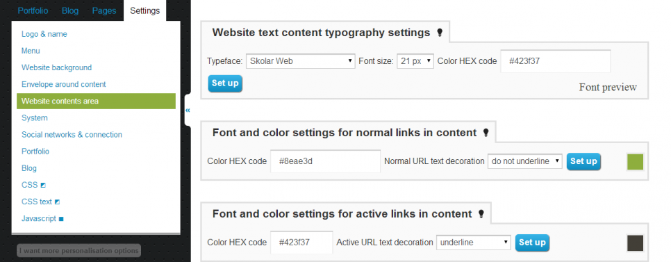
So if you want some special look for your headlines or other improvements that you otherwise wouldn't find in your text editor, contact our customer support and we can set a new style for your whole website, that will then effect your editor and your whole website.
And what color combinations are best for your texts? Since anyone can remember, white background with black text (or near black, because 100% black color doesn't exist in nature) was proven to be the most efficient, but you can also use other dark text on light background (possibly even vice versa, for example white text on black background, although readability of your text may start to suffer at this point).
But we most certainly don't recommend you to use colors that are hard to read. That means combining light colors with light backgrounds or dark fonts with dark backgrounds. You need to always imagine yourself in a position of a visitor that came to your website for the first time and tries to make sense of it all. And if he comes across a hard to read text, he won't have many reasons to stay on your website. Further problems may then be presented by differently set monitors.
Because if you choose colors with a wrong contrast, it could become completely illegible on some device. So if you won't be sure about any of your visual adjustments, you can always contact our customer support, or we can set up your entire website.
Structure of Your Text
A key for the clarity of your text lays in its own structure, in other words in a clean and synoptic look for your website. That means separating your text to adequately long paragraphs, using our headings, bulleted or numbered lists, or images in your articles. This video can show you how you can play with editing of your text in the JuicyFolio text editor. How to then insert an image from your gallery into such text you can view here.
You must also remember that if you want your images to have the same horizontal position as your paragraphs, you need to add it the same text block property as to the rest of your article.
And if for example none of the JuicyFolio fonts suit you, you can pick a different font on Typekit.com and we will then install it into your JuicyFolio administration.

